When you visit a website on your smartphone, what’s the first thing you usually notice? If it’s not how mobile responsive the website is, then it’s probably how tiny it looks and how difficult it is to read the text.
Poorly designed websites that are difficult to use on smartphones quickly lose visitors and conversions. To put it simply, if your website isn’t mobile responsive, then you’re doing yourself a disservice in this modern age of portable technology and worldwide web browsing.
Your site visitors are everywhere
On their mobile phones, on their laptops, on tablets. But Google is an app. It’s important to consider how Google will rank your site. Google uses your site’s mobile friendliness as a major ranking factor for your website in search results pages.
Since it makes sense to assume that more and more people will use Google to search on their mobile devices than on desktop computers, sites that are optimized for mobile devices are simply much better positioned to earn higher rankings in Google’s results pages (and thus gain exposure). For that reason alone, having a mobile responsive website is nonnegotiable in today’s digital world. If you’re serious about SEO and being found online, you need a responsive website design.
Why Is Responsive Design Important?

You might be wondering why responsive design is important if you’re new to web design, development, or blogging. The solution is straightforward. Designing for a single device is no longer sufficient. Mobile web traffic has surpassed desktop traffic and now accounts for more than 51 percent of all website traffic.
The great bulk of your traffic will come from mobile consumers, whether you advertise on social media or employ an organic technique like YouTube SEO.
You won’t be able to maximize the ROI of your marketing efforts if your landing pages aren’t mobile responsive and simple to use. Poor conversion rates will result in fewer leads and wasted advertising dollars.
75% of consumers would not recommend a company with an outdated website
When it comes to your business, you probably know that a mobile responsive website is important. But just how important? If you’re not sure, just look at these stats: 75% of consumers would not recommend a company with an outdated website.
42% of people will wait 2 seconds or less before moving on from a website if they can’t easily find what they are looking for. Google reports that 55% of page views now occur on mobile devices and Google Rank takes into account several factors when ranking websites including site speed, which includes whether your pages are built responsively or not. If these stats aren’t enough to convince you why responsive design is imperative in today’s digital world, then think about who you want to reach – millennials!
Responsive Web Design’s Foundational Elements
We’ll go over the foundation for responsive website design and the various building components in this section.

CSS & HTML
HTML and CSS, two languages that manage the content and appearance of a page in any web browser, are the cornerstone of responsive design. HTML is primarily responsible for a webpage’s structure, elements, and content. To add an image to a website, for example, you must utilize HTML code. CSS is used to change the look and feel of items on a page created with HTML. CSS code can be found in the html document’s <style> section or in a separate stylesheet file.

Responsive Images
The simplest kind of responsive images uses a dynamic unit to alter the width or height, similar to how a fluid layout does. The percent unit is equivalent to a single percentage of the viewport’s width or height, ensuring that the image is proportionate to the screen. The issue with this method is that every user, even on a mobile device, must download the full-sized image.

Media Queries
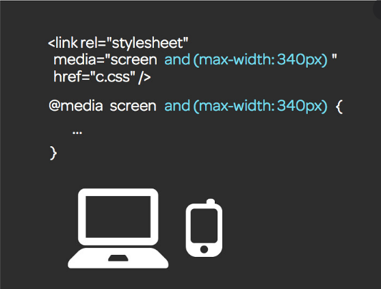
A media query is a CSS3 feature that allows you to modify the rendering of content to different criteria such as screen size or resolution. It functions similarly to a “if clause” in some programming languages, testing whether the viewport of a screen is large enough or too broad before executing the required code. In cases where the screen is at least 780 pixels wide, images in the “full-width-img” class will occupy 90% of the screen and will be automatically centered by equally wide margins.

Speed
The loading speed of your website should be a top focus when you’re trying to establish a responsive design. Sites that load in 2 seconds have an average bounce rate of 9%, whereas pages that take 5 seconds have a bounce rate of 38%. Your approach to responsiveness should not obstruct or delay the first render of your page any more than necessary. You can speed up your sites in a number of ways. You should think about optimizing your images, using caching, minification, utilizing a more efficient CSS layout, eliminating render-blocking JS, and enhancing your crucial rendering route.

Fluid Layouts
In today’s responsive design, a fluid layout is a must. In the good old days, every HTML element had a fixed value, such as 600 pixels. Instead, a fluid layout uses dynamic data such as a percentage of the viewport width. Based on the size of the screen, this technique will dynamically expand or decrease the sizes of the various container elements.

Flexbox Layout
Flexbox is a CSS module that allows you to layout many items more efficiently, even if the size of the contents inside the container is uncertain. A flex container expands or shrink’s things to fill empty space or prevent overflow. These flex containers have a variety of special properties that you can’t alter with a conventional HTML element, such as justify-content.
Consumers spend 90% of their online time on mobile devices
Today, mobile responsiveness website design is a non-negotiable. It’s no longer an option to have a website that only responds well on desktop and poorly on mobile. As Google Rank has now put more emphasis on mobile responsiveness of websites, customers have come to expect fast, intuitive shopping experiences with access to all products in order to make informed decisions quickly and easily.
. If you’re not thinking about optimizing your website for mobile today, you could be missing out on business and sales.
Don’t miss out on traffic opportunities
When you create a mobile responsive site, it’s crucial to give users on all devices a great experience that includes all of your website’s pages and content. If they can’t access that information and experience what you have to offer, then you might be losing out on traffic opportunities.
Whether your visitors are accessing your site through desktop or mobile, they should be able to see exactly what they need, when they need it. If users are unable to see your full range of offerings because of a lack of responsive design capabilities or other issues with your mobile strategy, then these potential customers may simply move on to one of their competitors who does meet their needs – thus costing you valuable SEO potential in an increasingly competitive market.
Engagement rates are higher on mobile
According to Google’s recent data, over half of U.S. smartphone users say they visit Google several times a day and over one-third say they do so on their phones exclusively. In fact, 27% of smartphone users now conduct local searches directly from their mobile devices—and these consumers are 65% more likely to use mobile as their primary search channel.
If your business wants a competitive edge in 2022, you need to be found by people searching for your services on mobile devices; after all, 86% of online activity will take place via a mobile device by 2022. For many businesses, that means adding responsive web design (RWD) to your marketing strategy.
You can use Google’s mobile-friendly testing tool to discover if your website is mobile-friendly or not.
This is the way forward. Get onboard now!
Responsive design has been touted as one of the most important evolutions in website development since search engine optimization, and for good reason. If you’re going to design a website in 2022 or beyond, you need to build a responsive site.
You don’t have to be a professional developer or designer, either—there are services like GeopFX that will enable you to build an effective, SEO-friendly website for just about any industry for around $300. If you want your business to thrive online in 2022 and beyond, it needs to be mobile-ready!
Takeaways
Responsive web design is essential in today’s digital world for a number of reasons. Consumers use tablets and smartphones to interact with brands, which means your business needs to be available everywhere. More importantly, mobile devices are picking up speed as a search engine device of choice.
Google has started making mobile responsive websites more prominent in their search results – so if you have a mobile website that isn’t responsive, you could be losing out on valuable traffic to your website. Finally, it’s just good practice to ensure your site looks great across all platforms. After all, consumers expect everything they do online to work seamlessly across any device they choose.


